|
Nicholas Riley’s Weblog Thoughts from a computer science graduate student, medical student and Cocoa programmer (this week). |

| Sun | Mon | Tue | Wed | Thu | Fri | Sat |
|---|---|---|---|---|---|---|
| 1 | 2 | |||||
| 3 | 4 | 5 | 6 | 7 | 8 | 9 |
| 10 | 11 | 12 | 13 | 14 | 15 | 16 |
| 17 | 18 | 19 | 20 | 21 | 22 | 23 |
| 24 | 25 | 26 | 27 | 28 | 29 | 30 |
| Oct Dec | ||||||
| More where this came from: |
| Current Log |
| Instant Outline |
| Subscriptions |
| About Me |
| Bookmarks |
| Software |
| Subscribe | |
| View RSS | |
| Email me |
made with![]()
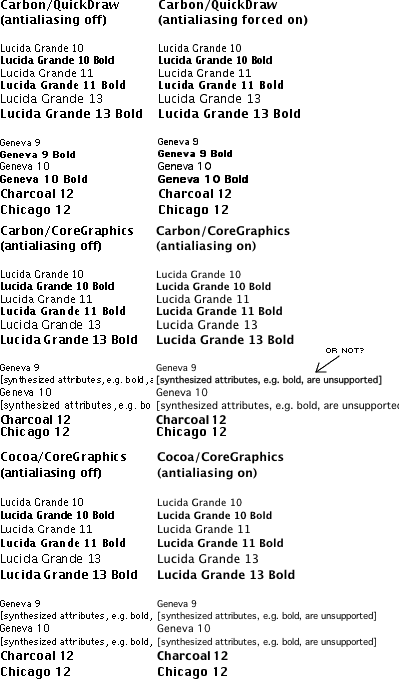
Mac OS X font renderingNat posted a question on the Boston BBS about why the fonts in FirstClass Client for OS X look so weird, and I decided to investigate. Disclaimer: I wrote this in a hurry. It got a lot of attention which I was not expecting: Low End Mac, mac.scripting.com, Mac Net Journal. I've made some revisions since this was first posted, and added links for people who want to know more. If there are any outright errors, please let me know (click "About Me" at left for my email address, or use the link at the bottom of the page). Thanks. Mac OS X font rendering is...complicated. Here's an example, the Mac OS 9 and X system fonts shown in three different applications (Tex-Edit Plus, WorldText and TextEdit):
As you can see, there are at least three paths that text travels from the font to the screen. Starting from the top, the first is the traditional, QuickDraw version, with the anti-aliasing introduced in Mac OS 8.5. The 'on-off switch' for this is the environment variable $QDTEXT_ANTIALIASING and the minimum size threshold is $QDTEXT_MINSIZE. Carbon applications still use this method for drawing text, to preserve font metrics: it's the non-"fractional widths" version. I've forced QD antialiasing to happen at small sizes above to demonstrate that text appears muddy, but readable—unlike the other versions, where small sizes disintegrate into gray rather than black. The second two use Core Graphics (Quartz) for rendering, also involving ATS and ATSUI in ways I don't quite understand. This font rendering system is derived from QuickDraw GX. It's the 'native' renderer on Mac OS X, as it's used for drawing menus, controls, etc. in Carbon and Cocoa (incidentally, Cocoa sometimes uses Carbon underneath, e.g. all menus are managed by Carbon regardless of what type of app they're running in). There are four minimum size thresholds for Core Graphics font rendering, expressed as NSUserDefaults/CFPreferences. They can be set for the system (NSGlobalDomain) or per-application: AppleAntiAliasingThreshold, AppleSmoothFontsSizeThreshold, AppleSmoothFixedFontsSizeThreshold and AppleSmoothAdvanceSizeThreshold. Some applications, such OmniWeb, provide direct control themselves. The on-off switch is CGFontDisableAntialiasing (in the CoreGraphics domain, set to YES or NO). There are several differences between the two Core Graphics methods. Static text in Carbon controls, and editable text in the DataBrowser and Unicode text edit controls (see iTunes and Sherlock in Mac OS X 10.1 for some examples of the Unicode control) is drawn by the Appearance Manager, which actually uses a slightly different font from Lucida Grande called LucidaGrande (even longer story...). Along with MLTE, which is the standard large-scale text editing control for Carbon on OS X, and any applications that decide to use ATSUI for font rendering directly, this is the second path ("Carbon/CoreGraphics" in the illustration above). The third path involves the Cocoa text rendering system. This also calls through to Core Graphics underneath, but it doesn't mangle font spacing when anti-aliasing is turned off. Compare the Geneva 9 on the bottom left of the illustration with its counterpart in the middle left. The odd spacing is obviously a bug, but it's been with us since Mac OS X 10.0, so I'm not sure of its chances of getting fixed. One advantage of Carbon/Core Graphics rendering over Cocoa/Core Graphics is support for synthetic font styles. If a font doesn't have an italic version, Cocoa doesn't try to slant the font: it simply won't let you have it. When I was preparing the images above, I thought MLTE did the same thing, but it turns out it doesn't (see the text identified with an arrow). Those of us who remember unprofessional-looking Mac DTP from the mid-80s with arbitrary and tasteless use of the synthetic Outline and Shadow text styles, or fonts like 24-point bitmap Geneva italic printed on an ImageWriter II, may cringe, but synthetic styles make sense in Cocoa too. You can't get WYSIWYG style menus in Cocoa apps without them, as there's no real Lucida Grande Italic in the system. Take a look in WorldText's Style menu: synthetic italic looks just fine. (If you were wondering, Core Graphics does not support outline or shadow text styles at all.) So what are all the Core Graphics rendering font size thresholds?
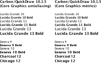
The only documented threshold is the first one. Ideally, FirstClass should use Appearance to draw buttons with DrawThemeText for text. Right now it doesn't. And until the GUI is revamped to accommodate Mac OS X's system fonts, it shouldn't. Many programs that made extensive use of Geneva 9 in their user interfaces have needed to make layout changes when porting to Mac OS X. While FirstClass still uses Geneva 9, I prefer that it continue to use QuickDraw, as the corresponding Core Graphics smoothed version is very difficult to read. And in fact, FirstClass Client 6.017 and later does exactly as I suggest: it uses Appearance to draw text for buttons which use Lucida Grande, but continues to draw Geneva 9 with QuickDraw. Mac OS X 10.1.5 and later provide Carbon applications drawing QuickDraw text the option to use Core Graphics rendering, with or without Core Graphics metrics. Several applications, such as recent versions of Microsoft's Office X, Internet Explorer, and Mozilla, now expose this option. Unsanity's Silk is a good way to experiment: it will let you configure the two options on a per-application or systemwide basis.
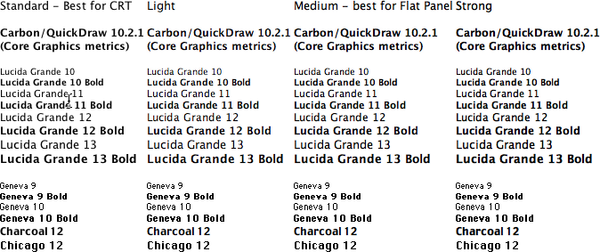
Mac OS X 10.2 (Jaguar) provides many more Core Graphics text antialiasing options. These include better default rendering (no more thin black text turning gray and impossible to read!), subpixel rendering to take advantage of the additional resolution on LCDs, and your choice of antialiasing style.
If you don't use Jaguar yet and want an idea of what you can expect, try out the CoolType options in Adobe Acrobat Reader 5 (Preferences: Display: Smoothing).
This page was last updated on 11/3/02; 8:30:28 PM.
|