Mozilla's bookmarks
A few people have recently asked me what exactly about Mozilla's bookmarks interface is so unusable. Perhaps they were joking, and if so, I guess I'm dumb enough to take their questions seriously. For this example, I picked one small yet visible piece of bookmark UI: the "Add Bookmark" dialog box. I'll try to enumerate the problems I see (or actually, your Web browser will count them for me thanks to the magic of the <ol> tag).
 The menu item is "File Bookmark..." but the dialog box is titled "Add Bookmark". The menu item is "File Bookmark..." but the dialog box is titled "Add Bookmark".
- The action button is labeled "OK".
- The size box overlaps the "OK" button.
- The window allows you to resize it to a size so small that several key user interface elements are hidden.
- The button labeled "Use Default" (default what?) has no visible effect.
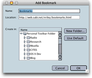
- The window does not resize in increments equal to the height of a list item.
- The label "Create in:" is aligned with the top of the control to which it refers, instead of properly with the baseline of the first line of text in that control. "Name:" and "Location:" are fine, although I think they'd look better right-justified.
- When you choose "New Folder...", a sheet appears to prompt you for a folder name. "New Folder" is capitalized, as if it were a proper noun when it isn't. The insertion point is placed at the end of the text "New Folder". How often would you like to name your new folder "New Folder"? The action button in this dialog box/sheet is labeled "OK".
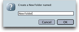
- Press Tab three times. Note that there is no visible indication of which user interface element has keyboard focus (it's the folder list), in the Modern theme at least.
- Every folder (and bookmark group—see below) has an associated disclosure triangle, regardless of whether the folder has any subfolders.
- It's unclear that simply selecting "OK" without any item selected will create a bookmark at the top level of your bookmarks list.
- Once you're aware of the above behavior and have selected a folder, it's impossible to decide that you want to create the bookmark at the top level instead, without cancelling and reopening the dialog box. Clicking outside the available area in the list does nothing; shift-clicking to deselect does nothing; command-clicking to deselect causes the solid highlight bar to become an outline, and the bookmark ends up in the outlined folder.
- It's possible to select multiple folders, in a contiguous or discontiguous fashion, but the bookmark only gets saved in one of them (and which folder it targeted is not visible in the UI).
 With my chosen double-double scroll arrows (admittedly not a supported configuration), and a small window size, the scroll bar draws three arrows, with the bottommost arrow extending outside the frame of the scroll bar. With each additional pixel of window height, a new visual anomaly appears. Try it, it's fun! With my chosen double-double scroll arrows (admittedly not a supported configuration), and a small window size, the scroll bar draws three arrows, with the bottommost arrow extending outside the frame of the scroll bar. With each additional pixel of window height, a new visual anomaly appears. Try it, it's fun!
- The checkbox "Bookmark this group of tabs", while conveniently named the same as the menu item, is confusing. What is "this"? It's more obvious when it refers to the frontmost window, as in the menu item.
- Bookmark groups (created with "Bookmark this group of tabs") appear with the same icon as any other bookmark folder; they don't use the stack-of-bookmarks icon as in the bookmarks display in the toolbar, sidebar or "Manage Bookmarks" window.
- You are permitted to create a folder inside a bookmark group; the folder is ignored when the group opens. This is true of the sidebar and "Manage Bookmarks" as well.
- If an "Add Bookmark" window already exists for a given browser window, selecting the same option again with the "Add Bookmark" window in front causes nothing to happen, yet the menu item is enabled. Selecting the same option with the browser window in front does not cause the "Add Bookmark" window to come to the front; rather, a new "Add Bookmark" window appears in the same location as the first.
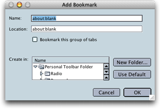 All tested with the most recent nightly OS X Mozilla build as of this writing, build ID 2002080611. When you have multiple tabs open, the following additional problems appear: All tested with the most recent nightly OS X Mozilla build as of this writing, build ID 2002080611. When you have multiple tabs open, the following additional problems appear:
- The default size for the dialog box is unusably small, showing approximately 2.1 bookmark folders in the scrolling list.
- The dialog box does not remember its size or position between invocations, repeatedly appearing with the same pathetic size.
- The dialog box appears in the position where a sheet should be relative to the frontmost browser window, but as a regular window, not a sheet.
 Once the window was resized such that it was large enough to display the full set of scrollbar controls, the bottom of the scrollbar was inexplicably one or two pixels too high, leaving a small white space underneath the bottommost arrow. Once the window was resized such that it was large enough to display the full set of scrollbar controls, the bottom of the scrollbar was inexplicably one or two pixels too high, leaving a small white space underneath the bottommost arrow.
- The obvious method of clicking a folder, then clicking OK, did not cause a bookmark to be filed. I had to double-click a folder to open it, then click OK. Performing one or the other operation (selecting or opening) caused no bookmark to be created when I clicked OK.
- Related to the above: the "OK" button was enabled even if you hadn't selected a folder, and the result of clicking "OK" was that the dialog box closed, and no bookmark was filed. (I guess it was impossible to "open" the top level.)
The sheet which appears as a result of a click on "File Bookmark(s)..." in the Bookmark Manager window includes some extremely poor wording. The folder list is labeled "Create in:", when the actual action performed is movement of the selected bookmarks from one location to another. And of course the action button, in a miracle of passivity, is labeled "OK", so it doesn't offer any additional guidance. In fact nothing is created, with the possible exception of angry mobs of users who subsequently give up on your program because it's so hard to use. How about "Move to:" and "Move" for the button?
At least Mozilla's interface (once you've got a window open) is fast to respond, doesn't crash or destroy your data, unlike certain pieces of research software I've recently had the pleasure of using. But Mozilla is production software, theoretically aimed at the average user.
In comparison, I do appreciate the love and affection given Chimera by its developers. Aside from a small problem relating to misset constraints in the nib file, and the "OK" issue, its bookmark adding interface is a joy to use.
This page was last updated on 9/11/02; 7:07:09 PM.
|

 The menu item is "File Bookmark..." but the dialog box is titled "Add Bookmark".


 With my chosen double-double scroll arrows (admittedly not a supported configuration), and a small window size, the scroll bar draws three arrows, with the bottommost arrow extending outside the frame of the scroll bar. With each additional pixel of window height, a new visual anomaly appears. Try it, it's fun!
 All tested with the most recent nightly OS X Mozilla build as of this writing, build ID 2002080611. When you have multiple tabs open, the following additional problems appear: